Google Maps is preparing two updates including an Android Auto redesign that’s rolling out now.
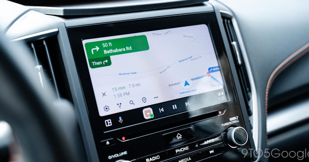
Attached to recent Google Maps updates and independent of your Android Auto version, a new design for the Maps app on Android Auto is rolling out. This new design adds a sidebar to the Maps experience in your car where controls live.
Where previous designs showed map controls off to the right side when you interacted with the map, but this new design constantly shows these controls. You’ll see zoom controls, the ability to chance the map’s orientation, adjust what directions are said aloud, and access settings. All of those controls are shown on a translucent bar on the left side of the screen.


That’s annoying, I assumed this was a bug. I spent 5 minutes trying to find a way to hide this.
Why would I need zoom icons on a touch screen with pinch zoom?
Aftermarket head units aren’t all capacitive (so they can’t do multi-touch)
I agree about the zoom buttons. But the rest looks quite handy. Changing orientation and (un)muting took too much interaction and therefore attention.
Using pinch zooming while driving seems impractical. Easier to just hit a button.