- cross-posted to:
- kde@lemmy.ml
- cross-posted to:
- kde@lemmy.ml
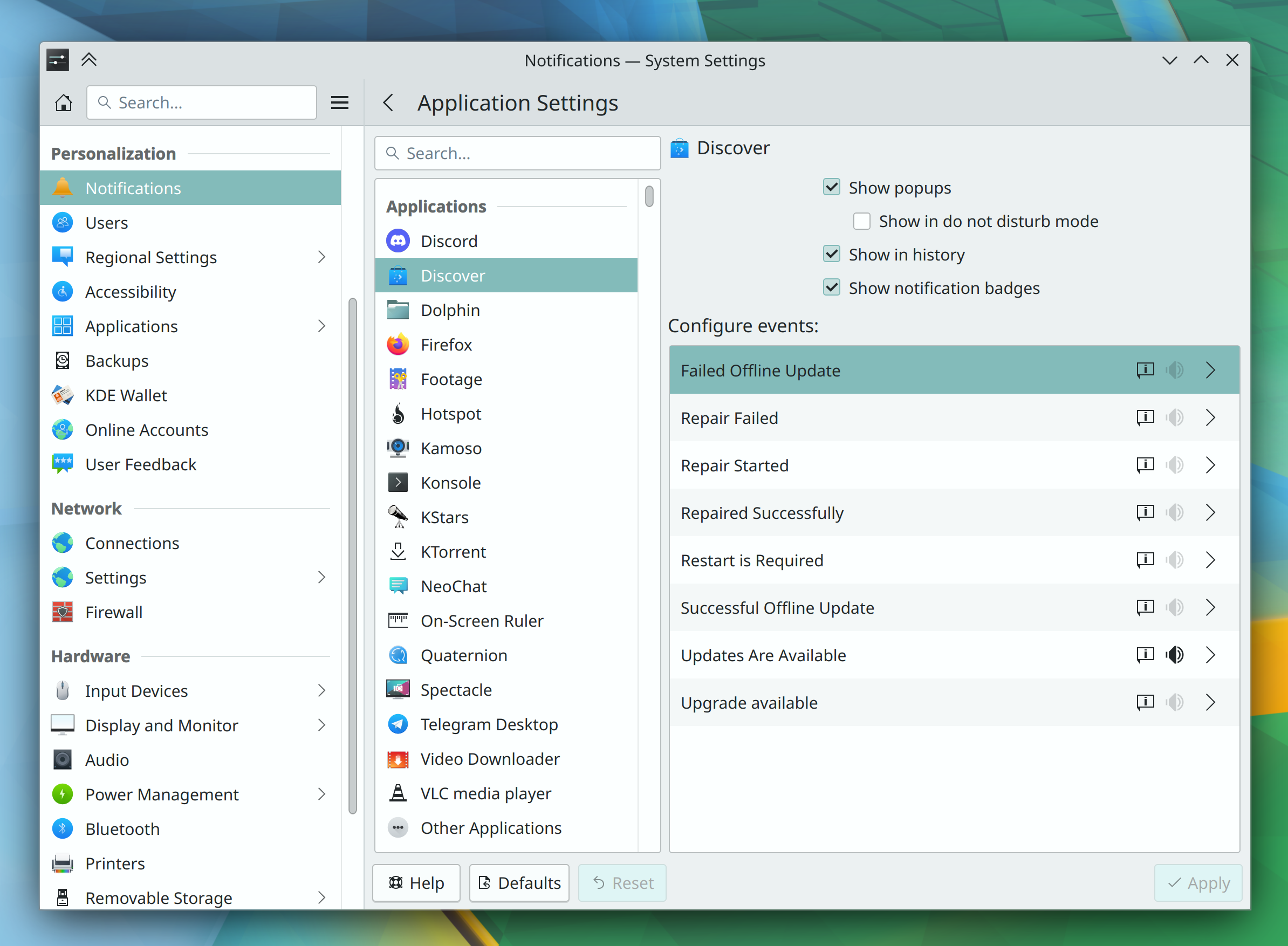
Excellent progress was made this week towards the goal of full sound theme support in Plasma 6, among other topics–including some important performance work for KWin!
I’m currently in Gnome again. Two weeks ago it was kde for a few months. I keep switching back and forth. :)
I switched to kde yesterday after a few months on gnome :-) Also tried Hyprland a couple of weeks ago but tiling WMs are not for me.
I’m forcing myself to use QTile on my laptop because deep down I honestly believe it’s more efficient, but man is it hard to get used to tiling WMs.
Hyprland does look really nice though.
I’m currently giving Karousel a go, seems like a decent step between a full on tiling wm (which isn’t for me, really) and a stacking one.
I always end up back in gnome. With a few adjustments it feels like home. Desktop icons, dash to dock, adw3-gtk theme for older apps, plus some small adjustments with the tweaks app.
I want to see KDE focus on its UX a bit more and break a bit of harmful backwards compatibility. Having multiple rows in the window header like the combination of a title bar a menu bar and an action bar that makes their combination tall AF, having a thousand disjointed panes, apps being completely rigid and non-responsive and using dated customisation options that only lead to inconsistent and ugly results when tampered with, and rejection of design paradigms that get praised and adopted by everyone like headerbars, all in the name of old theming technologies that depend on practically technical debt, like X11. KDE needs to adopt a vision that looks towards the future, not the past. Until then, I’ll stay in GNOME.
But I use KDE because of the separation that title bars offers
rejection of design paradigms that get praised and adopted by everyone like headerbars
please, use gnome and forget about the other de
Many of us don’t praise or want titlebars controlled by apps individually, and there are more reasons to keep them separate than just backward compatibility, FWIW.
But if you haven’t checked it out lately, you may want to look at the MauiKit/Nitrux stuff.
headerbars
Nothing against your personal preference but I take a good global menu integration over headerbars every single day 🙂.
I wouldn’t use Plasma if I didn’t have the option to turn on menus. The hamburger menu was a horrible design for desktops. Give me a title bar, menu bar, and toolbar. Small screen devices might benefit from minimization but not the desktop.
Good. Stay in GNOME. KDE is not and will never be for you
deleted by creator
Yep a more minimalistic approach to UI/UX would be great for KDE but I don’t think we will see it in Plasma 6
KDE feels like it has been designed by developers themselves whereas Gnome feels like it has been designed by actual designers. The UI/UX is more polished and beautiful, better than even MacOS imo. But as a power user, I prefer KDE. The amount of customization it offers is unmatched, overwhelming even.
It may feels that way to you, but KDE, and especially Plasma (since Plasma 5) has been designed by professional designers. We owe this notably to Jens Reuterberg who created the Visual Design Group within KDE, a group that is still very much alive. The feeling probably rather stems from the fact that KDE’s vision for design is less inclined toward a strongly polished, opinionated interface, but rather to preserve user’s choice?
Tangentially, is there a defined timeline with Neon for getting Plasma 6 once it’s released? What about when the new Ubuntu LTS drops?
KDE Neon is rolling release for DE. So it’s pretty much couple days waiting once Plasma 6 released or just instantly released.
The question is: when is Plasma 6 out?
If all goes perfectly it should be at the end of this year, so December 2023, but most likely we will have to wait a couple of months more.
deleted by creator
deleted by creator
deleted by creator
You can always change the icons,
Get new icons....from the icons setting page. Theme in KDE is very easy to change.Example
Theme: https://github.com/catppuccin/kde
Icon: https://store.kde.org/p/1340791
It’s a petty stupid thing for me to get hung up on - but I just find the icons and theming in KDE to be so, so ugly and dated. It stops me from ever really digging in to give it the try it almost certainly deserves.
Icons are the most easily changed part of the whole thing
No offense, but that’s a really stupid reason not to try it out.
Self acknowledged in the first four words of my post. But in my defense I don’t have to do anything to make a whole host of other distro not fugly and ancient looking, and I’ve got more important things to do these days than spend much time at all tweaking aesthetics in my desktop.
Kde is not a distro…
I get wanting a distro to look modern and cool by default. One that I like a lot that uses a modified KDE is Nitrux https://nxos.org


