
Anyone got any ideas for an icon or banner?
First off, we need a good icon for !newzealand@lemmy.nz. We don’t want to change the icon very often, if at all. It needs to work as a small circle and a square.
On the other hand, I would like to change the banner from time to time. I’ve just put one up, but it’s a stock photo. I’d love to use pics from the community. It can be hard to find pics that work because they get cropped very short and wide (740×230 px on the main page, even shorter and wider on Jerboa). Any ideas are welcome, doesn’t have to be scenery.
(If you don’t know what I’m talking about, go to !politics - the icon is the orange man lemmy, and the banner is the photo of the parliament buildings)
I’ve tried a few things out for the icon. The two I think are looking alright are…
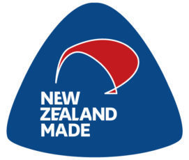
1. Made in NZ kiwi


I tried triangle ones too, check the other comments
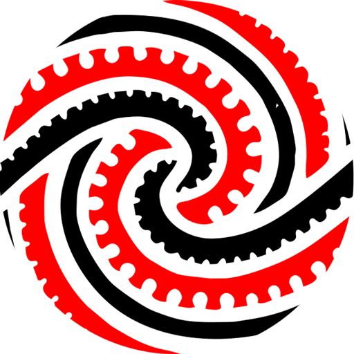
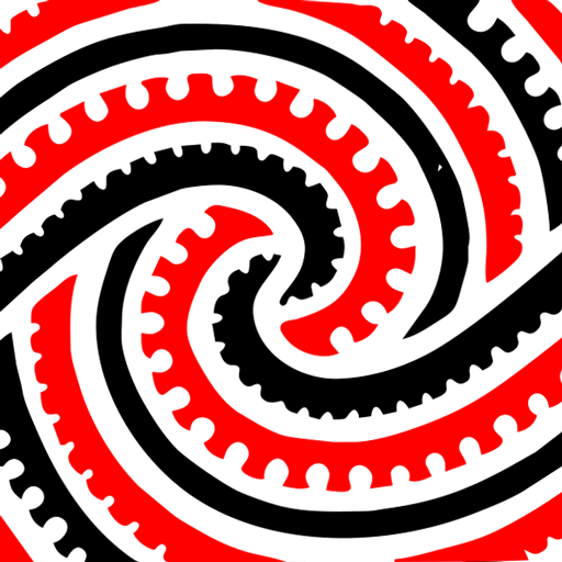
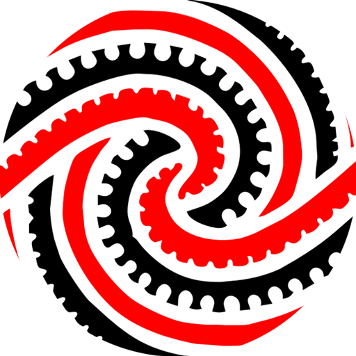
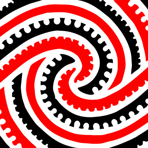
2. Modern Hundertwasser koru


I also tried some koru rafter designs but I think they're too busy
I’m not sure we should be using a military emblem for the community, even if it is the best air force roundel in the world. It might make people think we’re a military community or something.
I don’t like the triangle one from your other comment, but both of these look good! I’d be happy with either.
Yeah, I don’t really like the triangle ones either. But it was easier to show them than explain why they didn’t work.
Totally!
I like the rounded made in NZ much better than the triangle one and it should be recognisable at pretty small sizes.
Can I suggest the Airforce Roundel? For no other reason than I think it’s hilarious our airforce logo features a flightless bird.

Anyone good with Photoshop? Turn it into LaserKiwi…
I was wondering if you could get it to work in such a small space
What if we piss off the Air Force by disrespecting their mighty roundel? They might come and poke around under our feet.
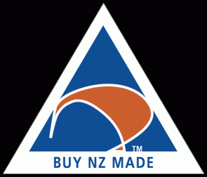
Is the Made in NZ logo still in use much? The original is a triangle but it should be recognisable shrunk to fit into a circle.
Yes, definitely the old spiky one. If we lop the logo off the bottom and brighten the colours, maybe.
I kind of like the shitty retro colours haha. But it’s not easy getting a triangle to work with both a square and a circle.
It either looks weird when it's a square


Or it doesn't fit in the circle


I don’t mind the second one, but I think it looks better without the triangle at all (see my other comment)
Laser Kiwi can fuck right off! It was funny at first, but now it’s just pathetic.
